Adding the titles
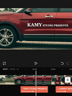
Hello and welcome back to my blog! Now that the main editing is done for my film, it was my turn to add in the titles. When doing the titles, I wanted to have a clean look for the titles. To make sure they were place nicely, I decided to look on YouTube for some inspiration.
While searching, I found the perfect video. My first step was opening up the app and loading in the edited videos. When I opened the project, I went into the text option and typed in my first title. I wasn’t sure about which font to use, so I made sure to cycle through a few. Ultimately, I picked a final three: Elegant, Sherif, and Poppins. It was difficult to chose one, so I decided to go my mom for some help. She enjoyed all of the options, and just like me couldn’t choose one. My next option was my sister. Fortunately, she was able to help me narrow my options down. She liked Sherif the best, so I decided to use that for my titles.
While going through and placing the titles, I decided white would be the best color. I tried out blue and red, however the contrast with the background didn’t really fit the aesthetic of film. After I finished this, I noticed a few minor mistakes. One of them was that the black overlay between the flashbacks and the hospital scene had a bit of white peaking through. To fix this, I place another black overlay on the film. With this done, it was time for my film to see the world. This is Kyra signing off!


Comments
Post a Comment